What are Pantone Colors, and where and when should they be used?
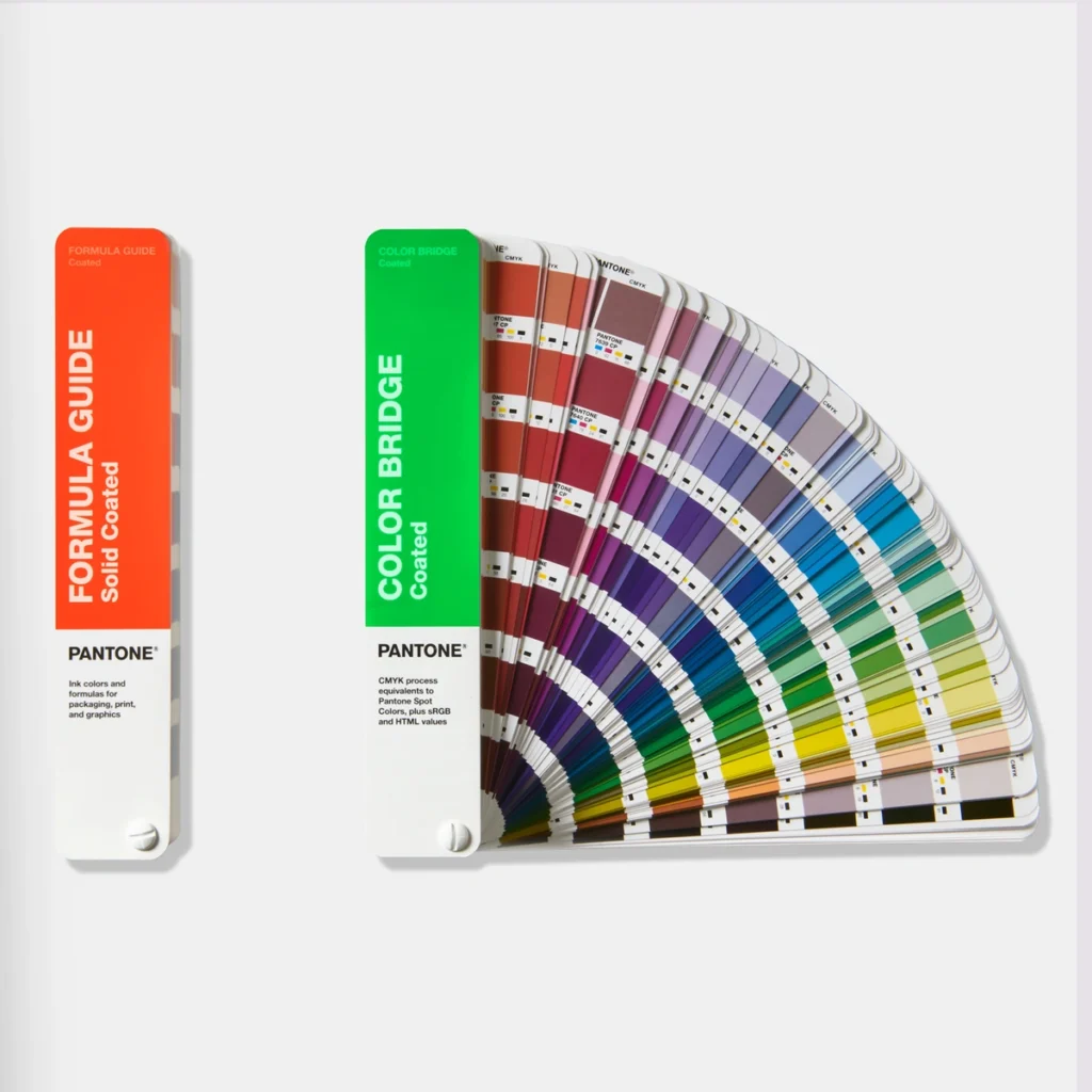
Chances are, some thought went into the colors in your branding. Ensuring that those colors are the same across websites, t-shirts, mugs, posters and pamphlets is important. Did you know that there are different ways to save color information? For example, Red Green and Blue (RGB) values are usually used for digital displays. Cyan Yellow Magenta and Black (CYMK) values are commonly used for printed physical goods. Using and converting between these systems can be tricky. The Pantone system uses a set of over two thousand colors that are meant to work well for printed and digital branding needs. Using Pantone colors means that someone from Pantone has done the tricky conversions, and that wherever a color is used, it will be as accurate as possible.
Three ways to deliver: RGB, CMYK, and Spot Colors
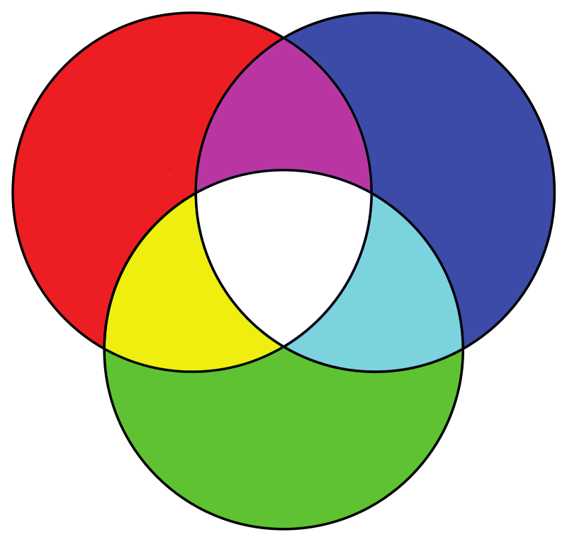
First up, RGB colors: What are they and where are they used? We’re all familiar with computer monitors and home printers, and since they typically use RGB colors, we’re most likely to be familiar with this system of making colors. Take your computer monitor for example: each pixel on your screen actually has three microscopic colored lights (you guessed it – red, green, and blue) that can be made brighter or darker. The lights blend together to make the colors you see. If you select a Pantone color, it will have an RGB value that you can use to specify your logo color on the web. The only trick is that if your monitor or printer is not calibrated, you may see slight differences in how the color “looks” on each device in the real world (similar to how lightbulbs have different “warm” or “cool” light, computer monitors can vary too).
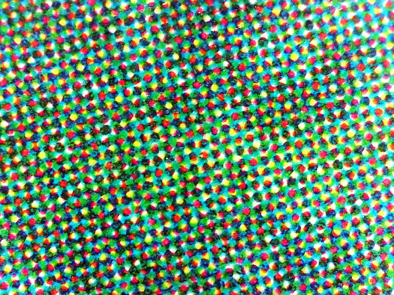
Next up on our color tour are CMYK colors: Commercial printers have long used four inks, Cyan, Magenta, Yellow and Black, that mix together to make the colors we commonly see on branded goods. The printers put down microscopic dots of the CMYK pigments, and our eyes “blend” the tiny dots together to see the intended colors. The great thing about commercial printers is that they will use calibrated printers. They will make test prints, and compare the output to Pantone color standards, helping with color accuracy. When you specify a Pantone color for commercial CMYK printing you’re removing much of the guesswork.
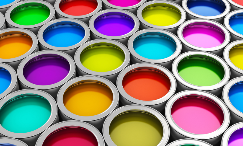
Finally, let’s take a look at Spot Colors, where and why are they used? When using Spot Colors, the process is referred to as Spot Printing. This is when the needed ink color is made beforehand, by mixing inks according to the Pantone recipe. Pantone uses 13 primary colors in their recipes! When printing with these inks – this is the most accurate system that can be used for branding color fidelity. The same ink that you selected from a Pantone sample card will be used to print your perfect color!
We hope that you find colors as interesting and important as we do. We also realize that for many, what matters most is that the branded products are “just right”, regardless of the “whys”. Let us handle the intricacies of making sure colors are as accurate as possible using the most economical processes. We have decades of experience working with customers and suppliers and can match the perfect process with your branding needs. Contact us at Brothers Branding today!